UX/UI
Design System
Data graphics
District Database—
A web-based tool to streamline the creation of amenity distribution graphics.
mock-up of final designs
Client
KPF
Role
Lead Designer
Agency
Freelancer
Tools
Figma, Principle

Kohn Pedersen Fox, a leading global architecture firm, faced the time-consuming challenge of manually creating amenity distribution graphics. I joined the project during the discovery phase and led the design of a web-based tool that automates visualization, improves accuracy, and empowers data-driven decision-making.

Discovery
After conducting a series of in-depth interviews with their target audience, KPF recognized a pressing need for expert assistance. Their collected data was rich and diverse, but they struggled to effectively synthesize, comprehend, and transform these insights into a user-friendly experience.
Product Roadmap
Defining The Challenge
To kickstart the design process, I conducted a thorough analysis and synthesis of KPF's research data. This revealed key insights such as:

1. Workflow Bottlenecks

Collecting District Data: Staff members struggled to locate and gather district data from various sources (project books, old client presentations, KPF’s Intranet, etc).

Creating Comparison Visuals: After gathering the needed data, creating and exporting comparison visuals was a time-consuming process, which often required the use of multiple design tools.

2. Users & Goals

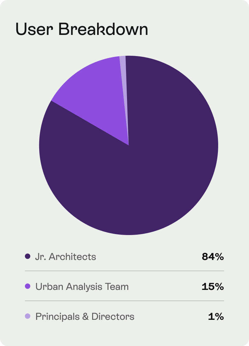
Primary Users: The majority of users will be junior architects, primarily engaged in data collection and visualization.

Secondary Users: Principals and directors, will utilize the product less frequently, primarily for data search purposes.

Tertiary Users: Urban Analysts will also engage with the product but their specific needs and objectives will be investigated in phase two.

3. Desktop First

Desktop will be the primary access device for most users, few principals and directors will be using tablets.

4. User Engagement

User engagement will vary by role and task. Junior architects will engage more with the product than principals and directors.

User breakdown pie chart
Device usage pie chart
User session pie chart
Metrics Breakdown
Empathizing With Users
To gain a deeper understanding of users' experiences, I mapped out their journey. By experiencing their challenges firsthand, I was able to empathize with their frustrations and uncover the root causes of their difficulties.
Step 1
Finding Data
Jr. architects struggled to efficiently locate district data across different platforms.
Different digital platforms
Step 2
Collecting Data
Data was collected using different tools which created a disjointed workflow.
Adobe and google icons
Step 3
Visualizing Data
Amenity distribution graphics were created manually which required significant effort.
Data graphic
Step 4
Exporting Data
Visuals were laid out to be added to client presentations, another laborious process.
Presentation slide illustration
Current Workflow
From Frustration to Efficiency
By analyzing the current workflow, I identified significant data access and visualization setbacks. I created UX artifacts such as personas, stories and flows, in order to gain a deeper understanding of user needs and help me design a more efficient and user-friendly experience.
User Persona: Architect
User Persona: Urban Analyst
User Personas
User Story Examples
User Story Examples
User flow example diagram
User Flow Example
Ideation & Design
Core Design Principles
To create a frictionless user experience, I focused on addressing users' pain points and prioritizing the following key objectives to make consistent and effective design decisions throughout the development process.

1. Enhance District Data

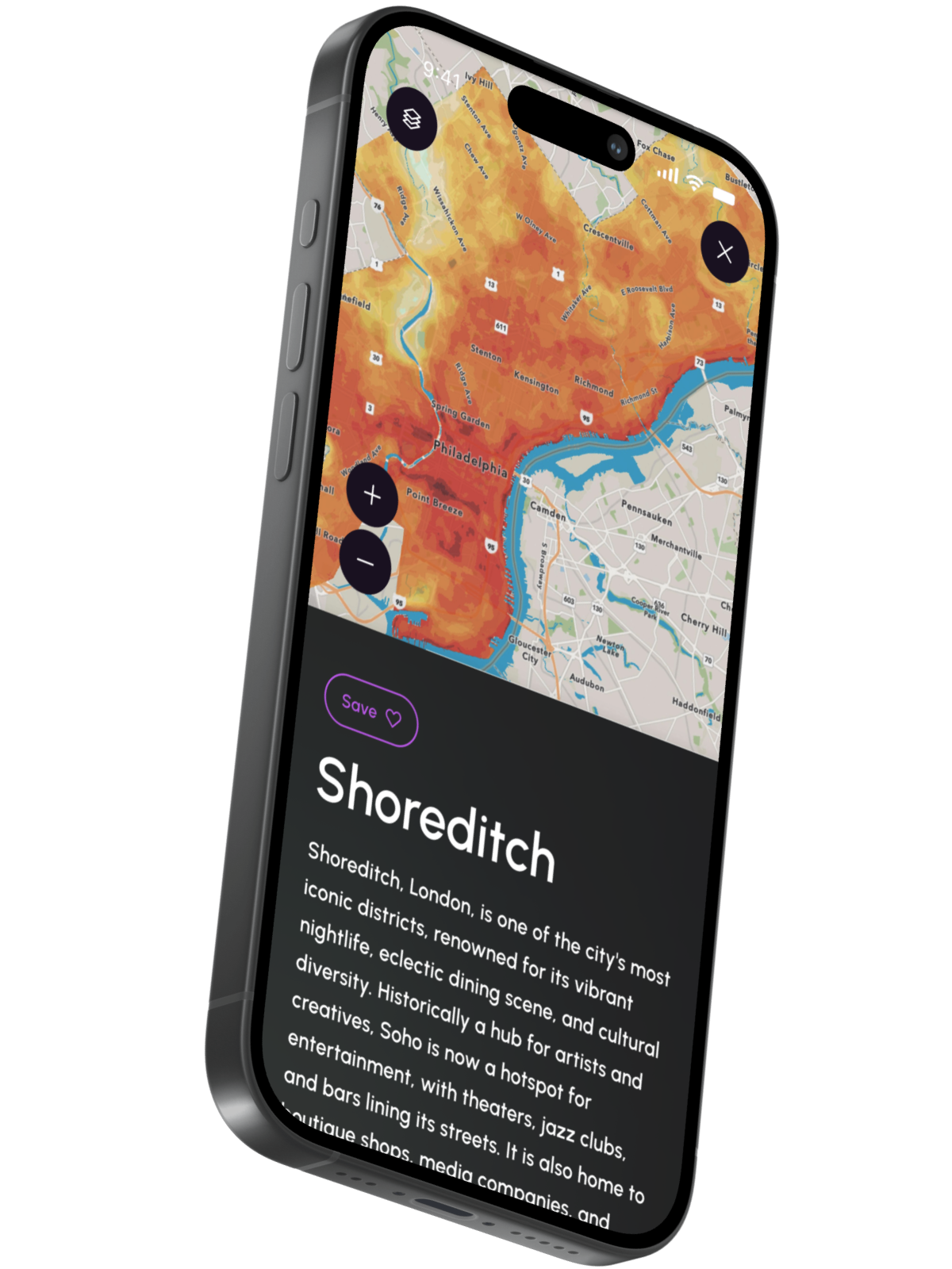
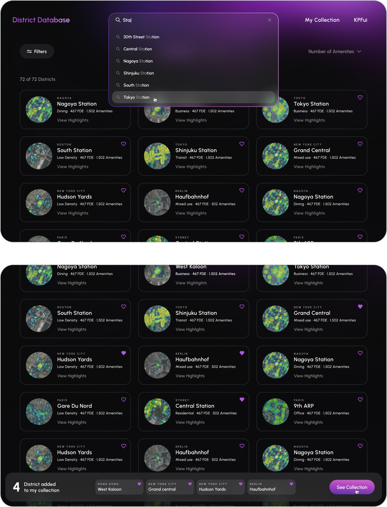
Develop a hierarchical and systematic structure for organizing and presenting districts' abundant data to facilitate rapid discovery and decision making.

2. Empower Users

Provide users with the right tools to easily and quickly discover, gather, and tailor district data to their requirements.

3. Boost Efficiency

Create an intuitive and user-friendly platform that streamlines workflows and reduces time spent on tasks.

To achieve these goals, we agreed with the client that a responsive website would be the most effective solution.
Sketches
Homepage Goals
To cater to the primary needs of users who search and gather data, the homepage design needed to facilitate the following tasks:

1. Agile Data Discovery

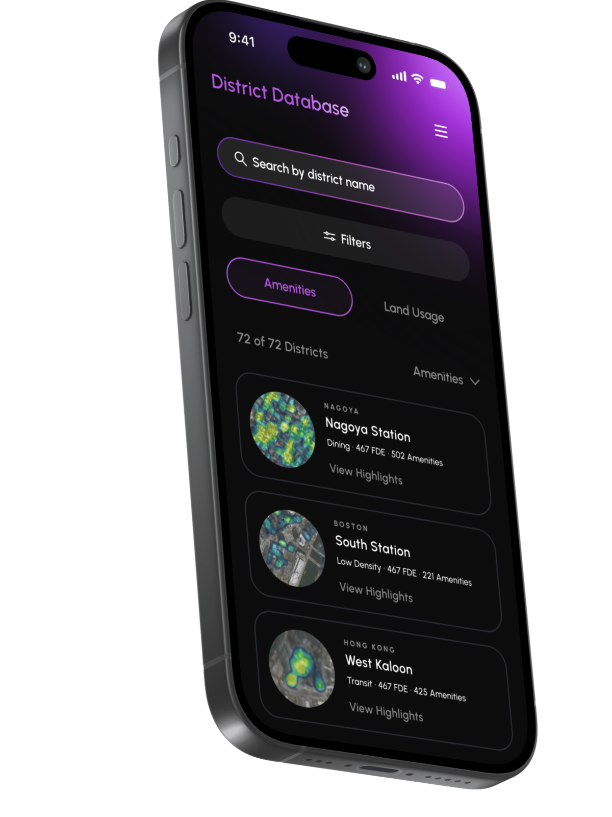
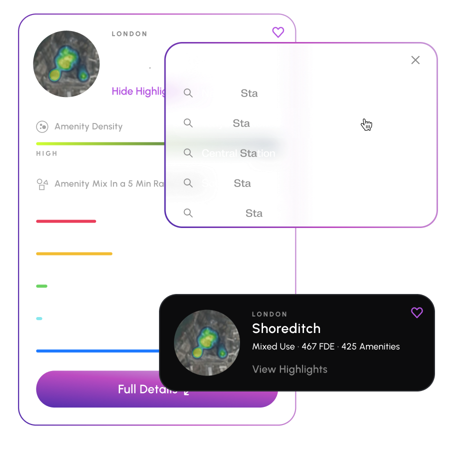
Empower users with robust search, filter, and sorting features to precisely pinpoint data, including amenities and land usage.

2. Granular Data Access

Provide options for accessing more detailed information when needed.

3. Easy District Selection

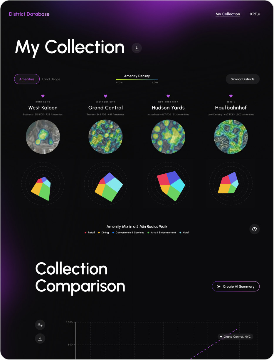
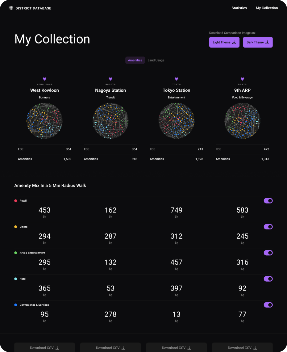
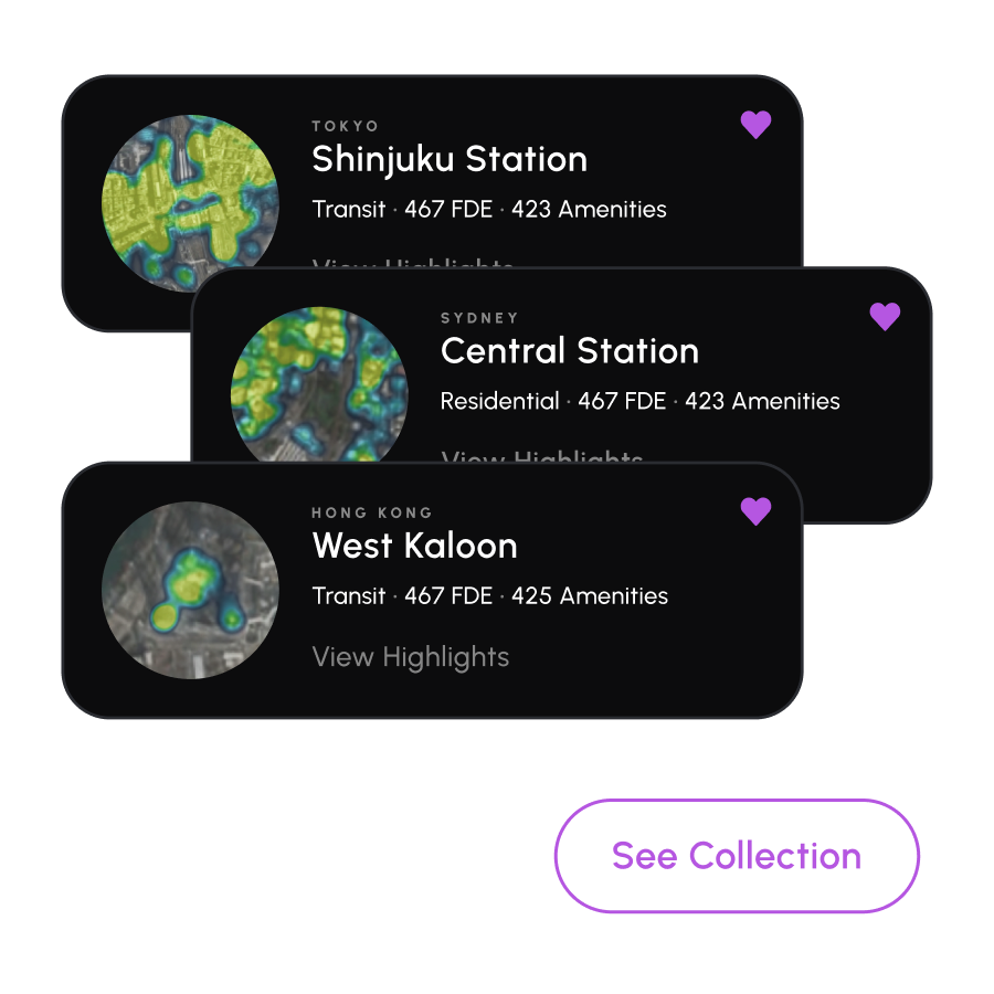
Enable users to build personalized district collections where they can easily save and manage their preferred districts.

Homepage design
Homepage support screens
Homepage iPad screens
Collection Page Goals
To customize and download comparison visuals, users can proceed to Collection Page. This page was designed to support the following actions:

1. Visual Data Analysis

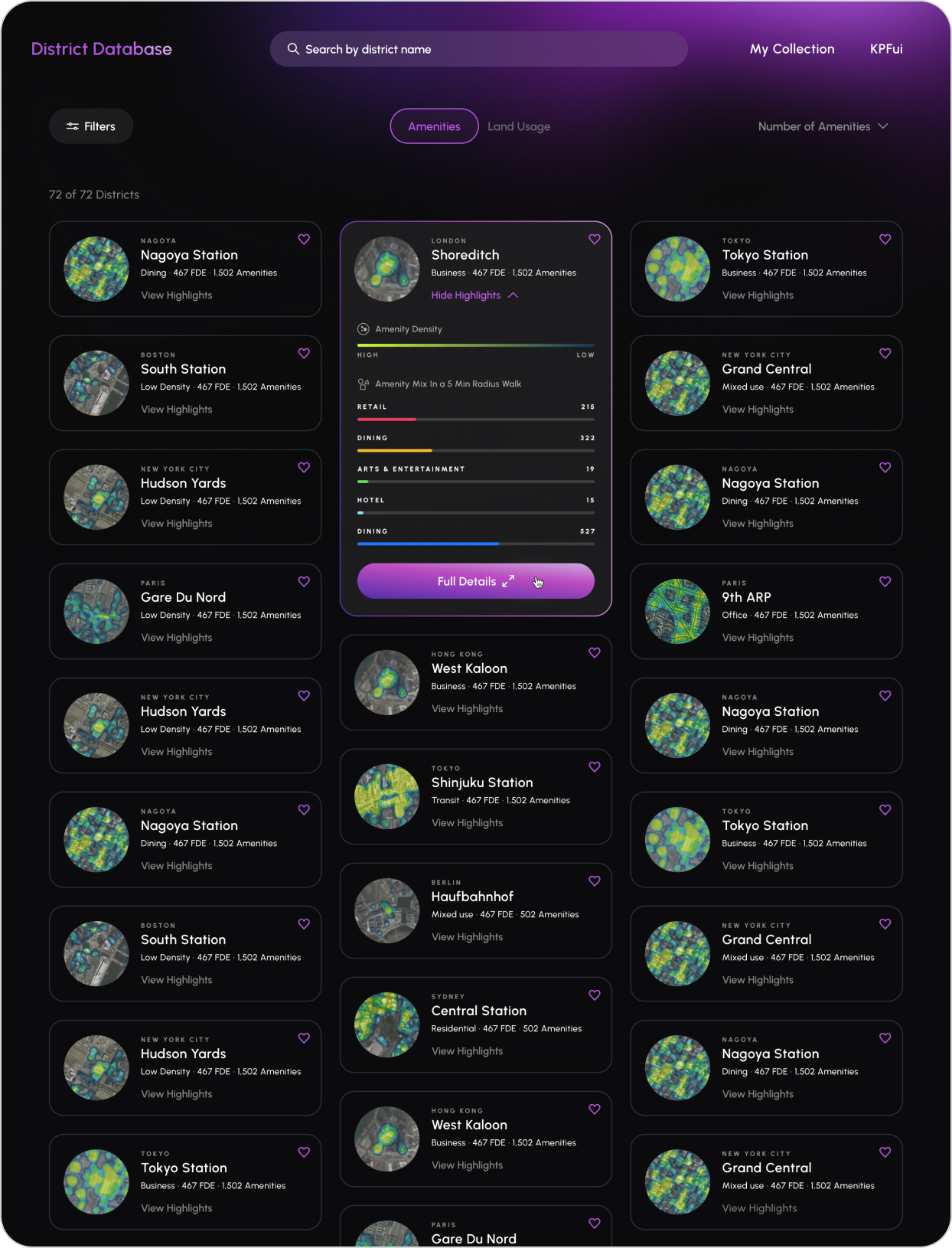
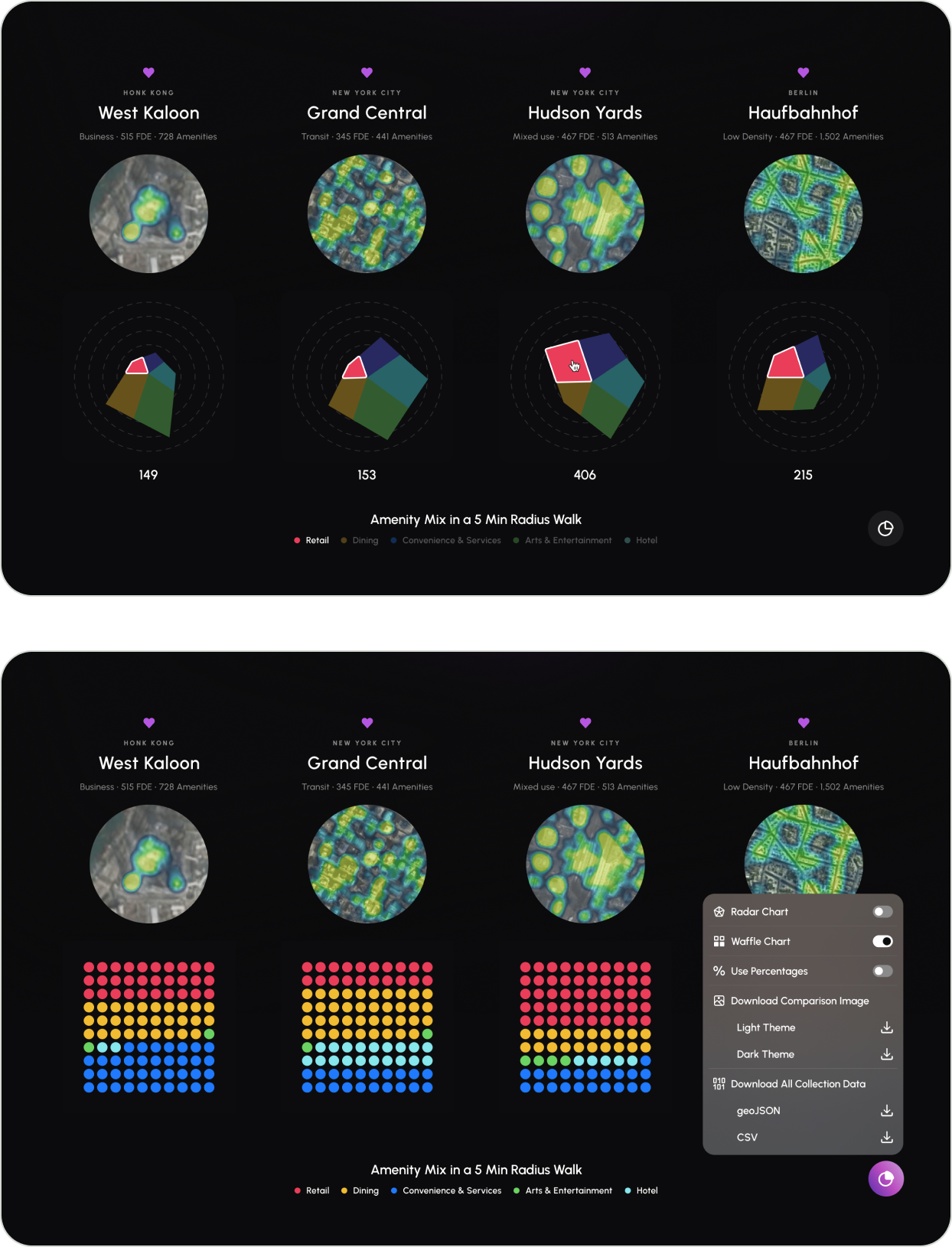
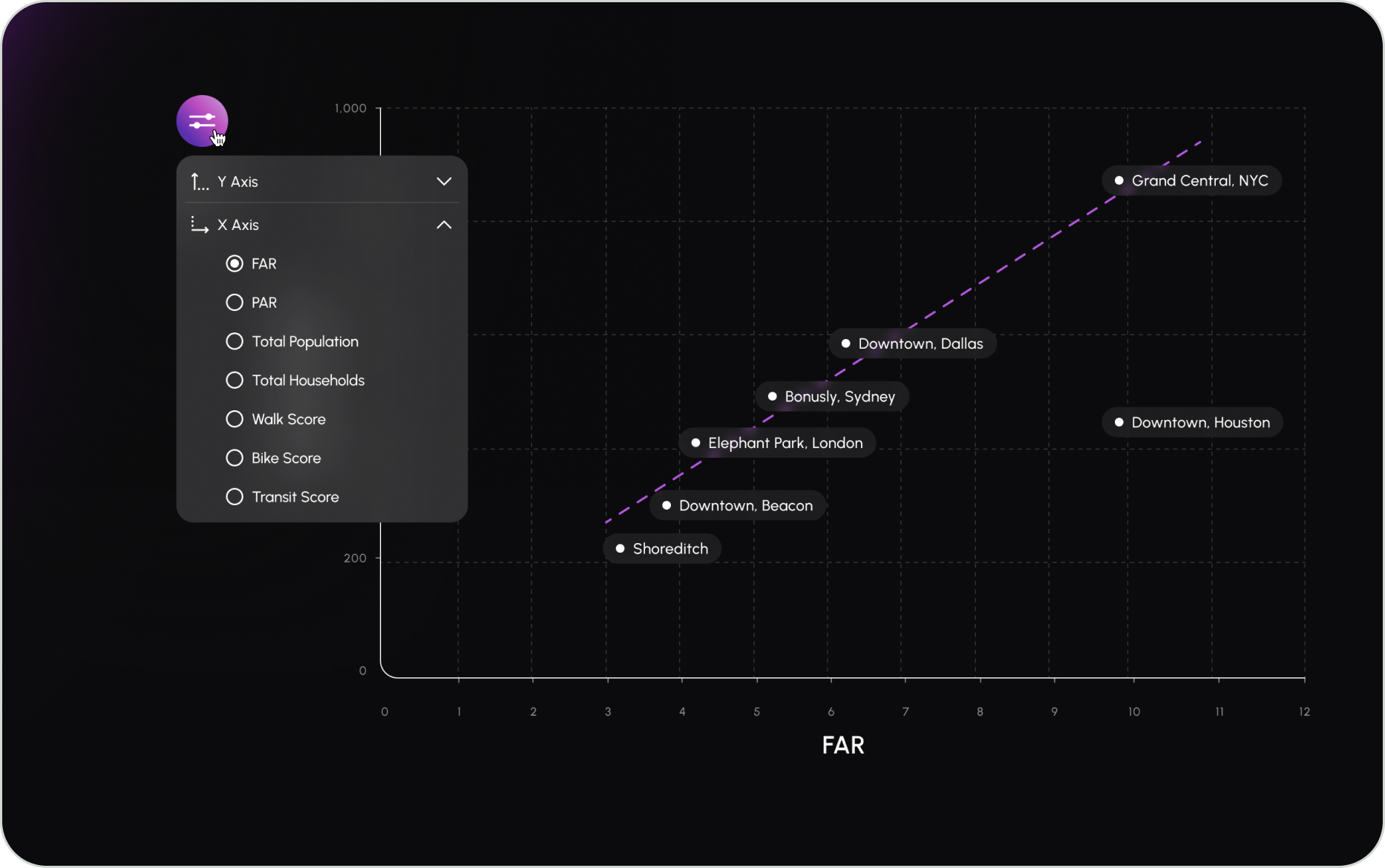
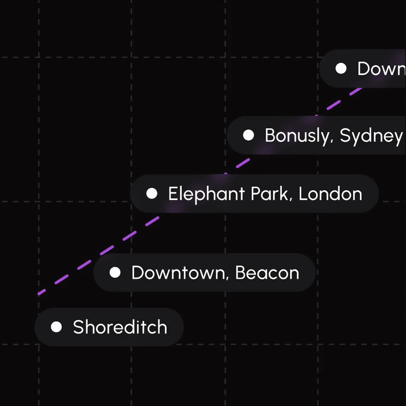
Compare and analyze district data through visually appealing and informative graphics.

2. Graph Customization

Adjust comparison visuals to highlight specific trends, patterns, or areas of interest.

3. Data Download

Download high-resolution images of comparison graphics for offline reference or sharing as well as specific district data.
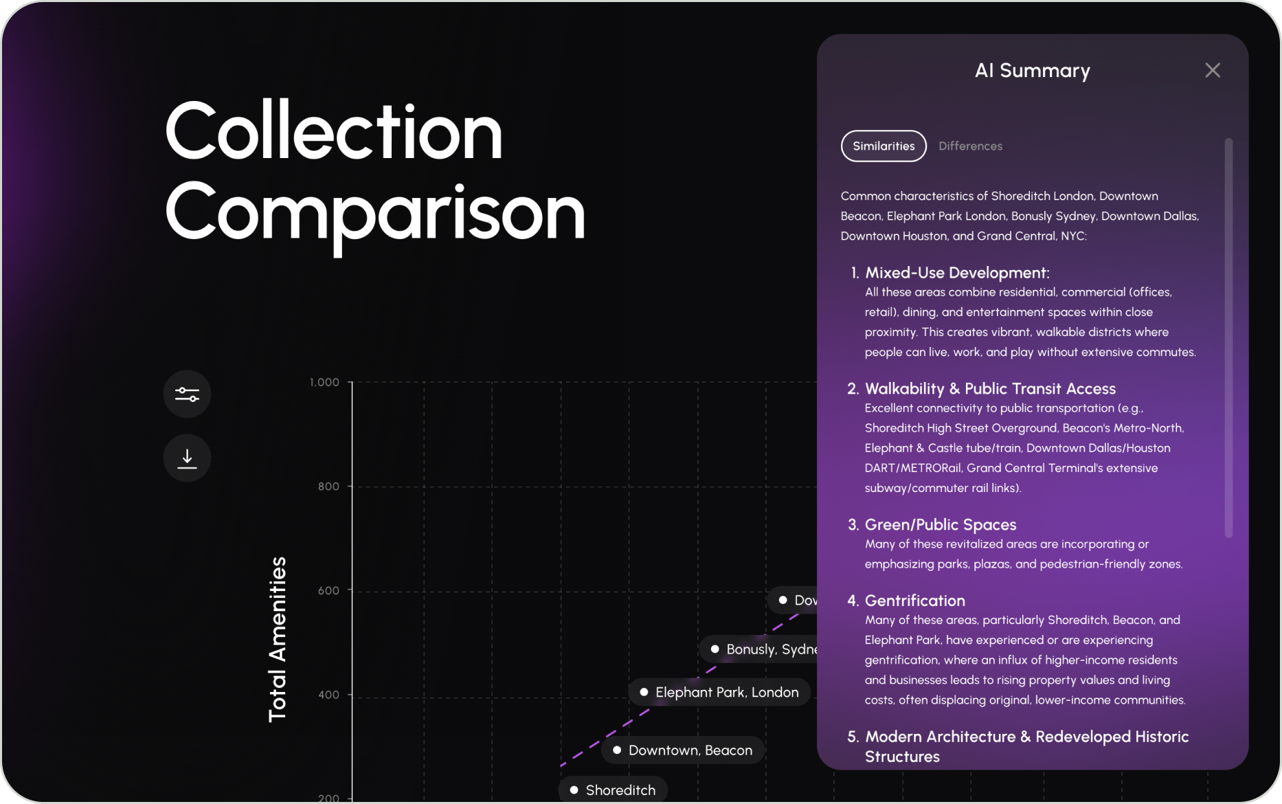
4. Easy District Removal

Remove unwanted districts from comparisons with a simple click, allowing users to focus on the most relevant data.

My collection design
My collection supportive screens
My collection iPad screens
Design System
Utilizing atomic design and an 8px grid, I created a scalable and responsive design system that provided a strong foundation for the development team.
User Testing
Users expressed satisfaction with the search, filter, and district collection features, requiring only minor adjustments. The majority of design updates focused on the collection page, reflecting feedback from both clients and users gathered during A/B testing.
Round 1 - A
Round 1 - B
Round 2 - A
Round 2 - B (final design)
Impact
The proposed designs and features will significantly enhance the efficiency and effectiveness of district data discovery, collection, and visualization. By streamlining these processes, I’m aiming to reduce user frustration and boost productivity, ultimately improving the overall user experience.
Challenge:
Finding Data
Jr. architects struggled to efficiently locate district data across different platforms.
Solution:
A centralized data repository, coupled with intuitive search and filtering tools, makes it simple to locate data.
Challenge:
Collecting Data
Data was collected using different tools which created a disjointed workflow.
Solution:
Users can effortlessly collect and curate districts with the streamlined collection tray feature.
Challenge:
Visualizing Data
Comparison visuals were created manually requiring significant manual effort.
Solution:
Comparison visuals are automatically generated for users, who can then customize them to suit their needs.
Challenge:
Exporting Data
Jr. architects struggled to efficiently locate district data across different platforms.
Solution:
Light or dark themed slides can be easily downloaded for seamless inclusion in client presentations.
Next Steps
We're in the final stretch of this project. I'll be collaborating with the KPF team to finish up the remaining screens and get everything documented. I'm confident we'll be able to launch this successfully.
Next—
Subway.com
A fresh digital look for Subway, aligned with their exciting new menu offerings.
UX/UI
Design System